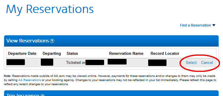
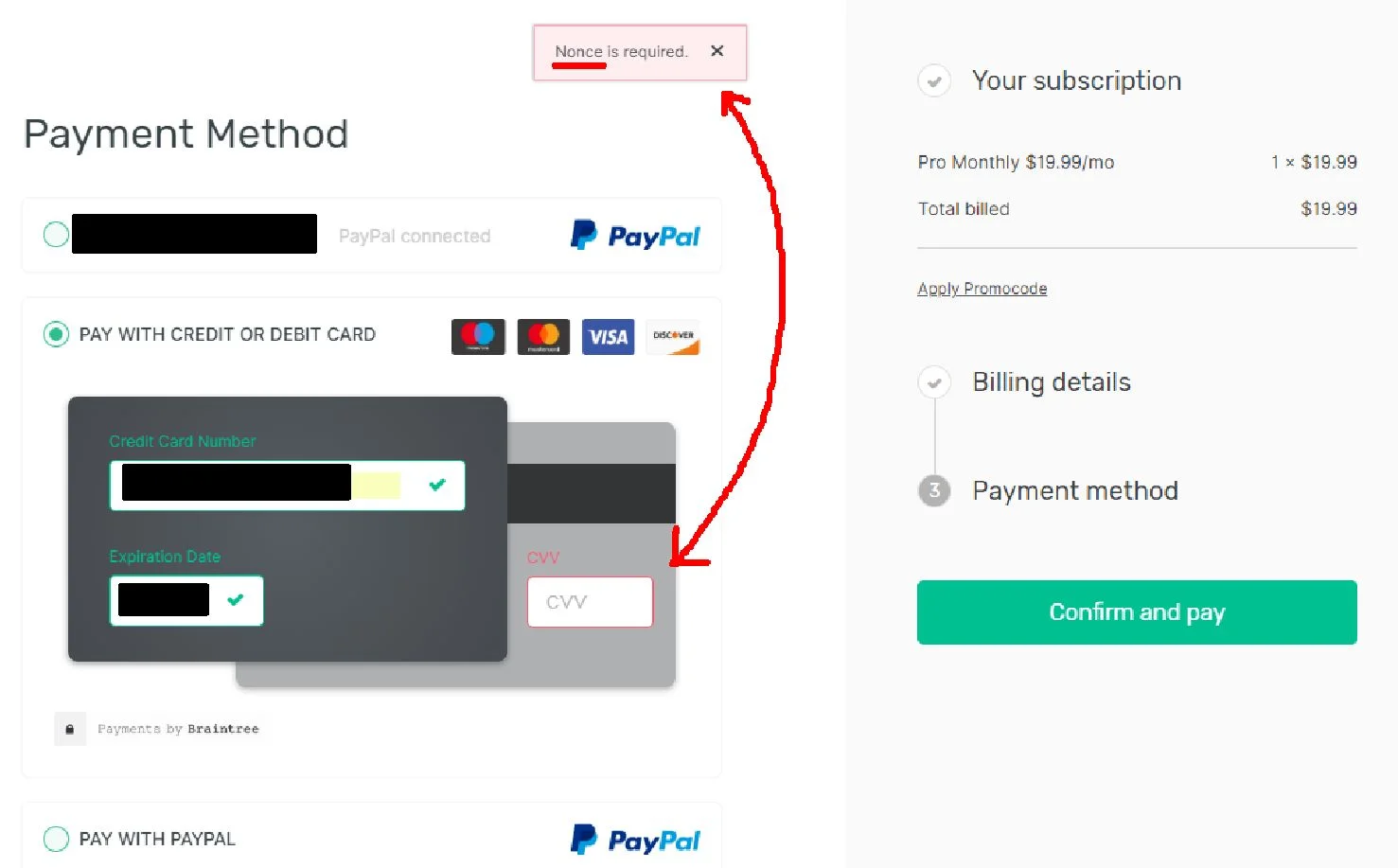
My finger was trembling a little bit in shock; floating, still hovering a millimetre over the left mouse button.
My heart was equally pounding a bit when I realised that I was but one mere click away from canceling a transatlantic flight scheduled for the very next day to see the beautiful woman who is now my wife.
How did it nearly come to this?
A usability issue. If I’m writing about it here, you know it’s going to be about a usability issue.
Read MoreNothing should take more than three clicks.
We need a 1-click button.
Three shalt be the number thou shalt count, and the number of the counting shall be three (*lobs thy Holy Hand Grenade of Antioch whilst counting to three because five is right out*).
When I first starting trying to evaluate digital interfaces (or even physical ones like credit card payment terminals), I thought that one of the user experience metrics I needed to focus on reducing was the number of clicks it took to complete any task. Surely that would provide a good, measurable benchmark of an experience with a product or service… right?
Read MoreToday, I'd first like to highlight the usability principles of speaking the users' language as well as recognising and recovering from errors. Maybe, just maybe you'll find your team working on one of these exact things and can take these tips as design considerations before going live…
Read MoreHow awkward would face-to-face interactions be if you could no longer answer questions with a simple "Yes" or "No", but instead had to speak using the same button terminology commonly seen on your phone or computer?
”Are you ready to pay for these clothes?” CANCEL!
Imagine the weird looks you're going to get as they slowly back away from you...
Yet, if a pop-up window appeared on your screen right now with any of those words on a button or two, you probably wouldn't bat an eye. After all, you've seen these labels being used to describe actions day-in and day-out…
Read MoreUX design leader and instructor, Jared Spool, recently tweeted a common, seemingly-critical warning that we still see too often on eCommerce and bill-payment sites, "Your purchase is in progress. Please do not leave this page or go back." But this got me wondering, what catastrophic effects would there be if we were given these process-interruption warning in other moments of our lives and those systems failed to consider our needs?
"Your elevator is descending. Please do not press another floor button or the elevator cables will snap." Hmmm...
Read MoreYou've likely come across web forms with an interactive security checkpoint in the past such as during activity touchpoints like account sign-ups, logins, and finalising purchases. However, yesterday whilst doing a little competitor research, I came across one of the worst "security" fields that I have ever seen...
Read More


