Perhaps I'll start a quasi-routine (as in, when I remember) of sharing more in-depth usability suggestions on here as I come across these issues. Maybe, just maybe you'll find your team working on one of these exact things and can take these tips as design considerations before going live…
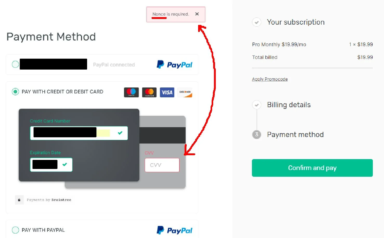
For today, I'd first like to highlight the usability principles of speaking the users' language as well as recognising and recovering from errors. I was filling out this online payment form today and got an error message, "Nonce is required." Now, I don't know about you, but this cryptography term "nonce" was unknown to me and I only know it's a cryptography term now because I had to look it up.
If users are having to look up a term on your site, you're using too much jargon. Be direct about what you want them to fix. If it's a credit card CVV field in this case, clearly just tell them what to look for, e.g. "CVV is required."
The next consideration is why did I even get this error message in the first place? After figuring out I was missing the CVV field (by consulting the dictionary haha), I was surprised to see this CVV field on the 'back' of the skeuomorphic credit card. While I appreciate the attempt to virtualise a physical card to help me enter my details, I believe there were a few "CRAP" gestalt principle design issues here (i.e. Contrast, Alignment, Repetition, Proximity).
Specifically, by purposeful design, this the CVV field wasn't vertically or horizontally aligned to the other credit card fields nor in close visual proximity so as I worked my way down the left-justified form, I never noticed this field. I even consciously thought to myself, "Hmm I expected to have to enter my CVV…" yet still never saw it. If you rather not say crap, then just remember: if you don’t do CARP, you get CRAP! (You can thank David Travis for that one haha).

