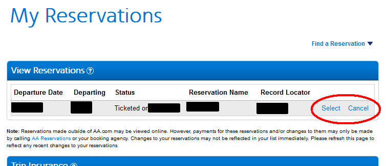
My finger was trembling a little bit in shock; floating, still hovering a millimetre over the left mouse button.
My heart was equally pounding a bit when I realised that I was but one mere click away from canceling a transatlantic flight scheduled for the very next day to see the beautiful woman who is now my wife.
How did it nearly come to this?
A usability issue. If I’m writing about it here, you know it’s going to be about a usability issue.
I re-discovered this self-documented memory from nearly 3 years ago whilst I was cleaning up my research and design playbook, and it was a stark reminder of how the slightest user distraction coupled with poor copy and contrast can make for a devastating outcome.
Let’s go back to that day again.
In looking for how to check-in to my flight, I had found my way onto the airline’s My Reservations page with an identically designed Select and Cancel button link next to my flight (see above image). “Selecting” my flight didn’t immediately speak to me as a way to check-in, so I clicked “Cancel” to back out of this page.
“I’ll go look elsewhere for check-in”, I half-subconsciously thought, “But first, I need to answer this phone call…”
And this is the point in the story where it’s worth pointing out to every content and UX designer how all of your user testing could be improved by the simple addition of one extra factor: a distraction.
Most testing I’ve seen and, I’ll admit, most that I’ve done too has been designed to be free of user distractions. Whether it’s being performed in a lab or remote and unmoderated, participants are often told to or setup to have minimised distractions.
We’re so focused on seeing how users get through prescribed tasks that we often forget to consider real life contexts of use, specifically, factoring in the infinite number of ways that their attention can be momentarily taken away by this or that. When they finally come back around, they’ll instinctively look around for clues to remind themselves of where they were and what they were trying to accomplish; you’ll know you’ve got a robust design when they can figure it out instantly and resume their task.
Distractions also come in the form of writing about lessons learned in the middle of a story, and this is what I felt like when I got back to my computer after answering the phone, but this time I saw a slightly different looking page showing my flight, except now there’s buttons for “Cancel now” and “Back to my reservations”.
“How did I get here?” I wondered again but then remembered, “Ah I still need to check-in,” as I moved the cursor over the “Cancel now” button and began to press down to click it.
“Wait. Don’t let go of the mouse button. What does the blue button say next to this?” That subtle feeling of an adrenaline boost began to influence my thoughts as if my own brain could see things I couldn’t as if I was about to step into oncoming traffic yet a friend held me back.
I moved the cursor away from the buttons and let go so that nothing happened as I got a better look at what this page said.
“Why does it say “Back to my reservations”? Where am I? … Whoa, what?! This is a Cancel Reservations page! Was I about to cancel my flight?!”
A personal air disaster just narrowly averted.
And then Steve Krug came to mind. “What’s the smallest, simplest change we can make that’s likely to keep people from having the problem we observed? (Rocket Surgery Made Easy)”
Changing that first “Cancel” button label to “Cancel flight” on the first page might have been that simple answer. A little bit of button contrast to give more suggested priority to “Select” over “Cancel” wouldn’t hurt either.
If users were still unintentionally getting through to the Cancel A Reservation page, there’d be a lot more to look into the content design; from bold warning lines that blend-in with column headings, Notes that look the same as the previous page, and more changes that could benefit from understanding the fundamental design concept that people do not read, they do what looks good enough.
I wonder if the airline ever realised what dangerously destructive of a usability issue they had on their hands…

