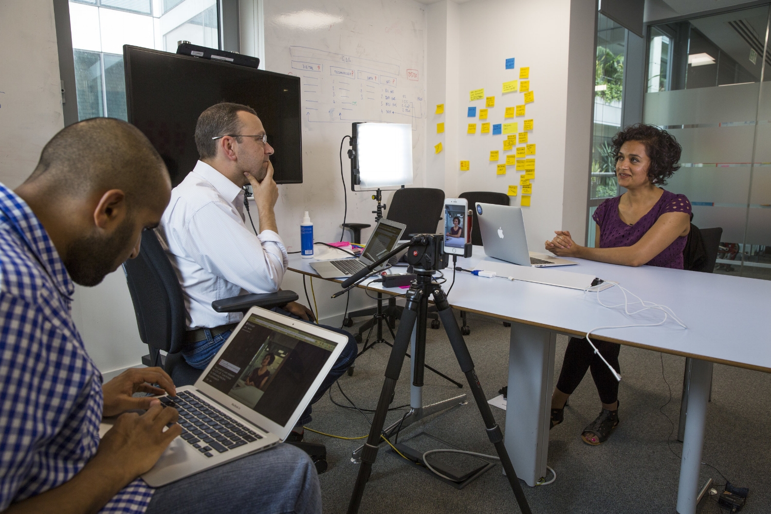
Today I chimed in on a UX introductory group's discussion on Facebook regarding where to start for personas and where to go from there. I was first trying to provide advice on how to help pull out a research participant's current journey as a method to see what their goals are, their problems, their motivations, their behaviours, etc. However, someone asked me if I use a different process than getting a persona written and going off into design.
The following was my in-haste attempt to reply and explain how there is so, so much more that should be done before actually trying to design anything on paper, least of all digitally.
Read MoreI just finished listening to the March 31 podcast of Human Tech with their guest Nick Fine (@doctorfine) who was brought on to introduce an idea that shouldn't be radical. He reiterated for all of us that a user experience (UX) is a thing that we all have, it's definitely not something you "do", and above all, research is your ultimate key to success.
One of the main misconceptions companies, stakeholders, and even some self-proclaimed "UX Designers" have when they consider "designing a user experience" is that designing a UI based on all of the best principles and practices will give them what they think they need. But as we know and try to teach, no amount of superb UI design will ever be a catch-all replacement for the need to perform in-depth user research to validate the core ideas being investigated and developed.
As with any good educational podcast, it leaves me wondering, "So where am I fitting in? Am I on the path I want to be on for the sake of us all?" ...
Read MoreUX design leader and instructor, Jared Spool, recently tweeted a common, seemingly-critical warning that we still see too often on eCommerce and bill-payment sites, "Your purchase is in progress. Please do not leave this page or go back." But this got me wondering, what catastrophic effects would there be if we were given these process-interruption warning in other moments of our lives and those systems failed to consider our needs?
"Your elevator is descending. Please do not press another floor button or the elevator cables will snap." Hmmm...
Read MoreWhenever I'm told, "Make this thing", my first reaction is always, "Why?" In this first #DailyUX challenge, we were given the task of designing the perfect wallet for a friend. However, in order to satisfy that nagging "Why?" question, I knew that we'd all be better served by understanding my friend's current problems rather than jumping straight into the design phase of a releasable product, so that's what I set out to do...
Read MoreYou've likely come across web forms with an interactive security checkpoint in the past such as during activity touchpoints like account sign-ups, logins, and finalising purchases. However, yesterday whilst doing a little competitor research, I came across one of the worst "security" fields that I have ever seen...
Read More


